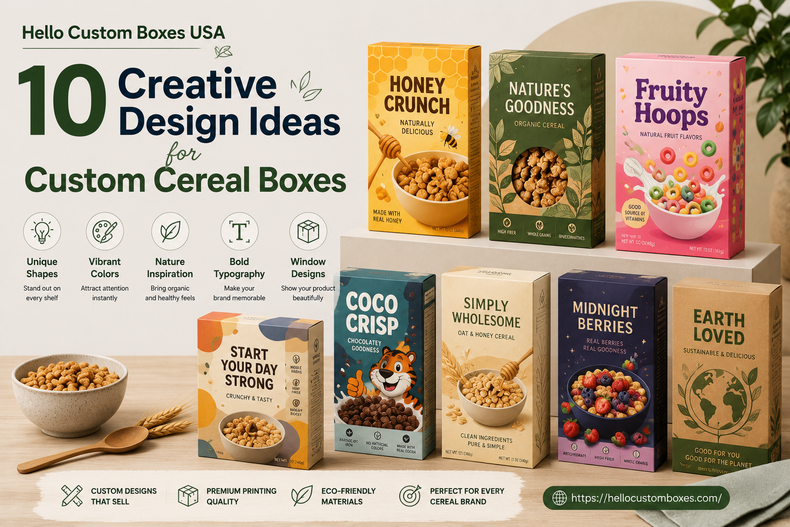
10 Creative Design Ideas for Custom Cereal Boxes
Because your box deserves just as much flavour as what’s inside.
If you’ve ever wandered down a cereal aisle — which, let’s be real, we all have — you know one thing: it’s loud. Bright colours. Cartoon mascots. Claims screaming “high-protein,” “low sugar,” “all-natural,” and “made by forest elves.” And that’s before you’ve even touched a box.
Here’s the deal: you’ve got about five seconds (if you’re lucky) to catch someone’s attention. And even less if you’re online.
So how do you make sure your cereal box doesn’t just blend into the blur?
Let’s walk through ten creative (and practical) design ideas that can help your cereal packaging actually stand out — and maybe even get shared.
1. Use Typography That Isn’t Boring
1. Choose a font that isn’t boring It’s the type of bold, generous or funky type can be seen halfway across the room. But don’t stop at big — go purposeful. Your brand’s name should reflect your brand’s personality rather than being a simple the words on a page.
While you’re there, why not include an irreverent tagline to attract people? “Made to Munch” or “Cereal-ously Good” could bring smiles, while also staying in the forefront of mind with customers.
Bonus Points: Play around with various angles to your textseither diagonally, vertically or even upside-down depending on your style.
2. Go Minimal (Yes, Even for Cereal)
Sometimes, less is more, so it’s best to keep things simple to get the most impact. Sometimes less does not necessarily mean more.
A calm, two-tone or monochrome design can make your box feel clean, modern, and premium — especially if you’re going after the health-conscious or adult market.
Think: off-white + gold foil. Muted green + natural kraft. Matte black + simple text. Quiet, but confident.
3. Let People See What They’re Getting
If your cereal looks good, show it off. A window on the box — even a small one — lets people see the real thing. That instantly builds trust and appetite appeal.
Just don’t make it boring. You could do a clear cutout in the shape of a smiley face, a fruit slice, or even your brand’s logo.
Quick tip: Use eco-safe film for the window if you’re going the sustainable route.
4. Bring the Back Panel to Life (Or the Sides!)
Most brands treat the back like an afterthought. But it’s actually prime real estate.
Why not turn it into a QR-code game? Or a little “meet the maker” story? Or a quick breakfast hack using your cereal?
Parents, kids, and even distracted adults (like me) read cereal boxes during breakfast. Give ‘em something fun, useful, or meaningful.
5. Make the Box Feel Good
Packaging isn’t just about how it looks. It’s also about how it feels in someone’s hands.
Try a soft-touch coating that feels almost suede-like. Or emboss your logo so it pops under your fingertips. Even a raw, kraft-paper texture can send the message: “we’re natural and proud of it.”
It’s a small detail — but trust me — it makes a difference.
6. Tell a Quick Story (Without Getting Long-Winded)
Every product has a story, and yours probably does too. You don’t need to write a novel — just a few heartfelt lines can go a long way.
Talk about where your ingredients come from. Or why you started making cereal in the first place. Or how your grandma’s recipe sparked the idea.
Real stories sell. And more importantly, they connect.
7. If You’re Sustainable — Say It With Style
Recyclable. Compostable. Soy-ink printed. Great — but how you show that matters.
Try kraft board with soft, earthy colours. Ditch the plastic if you can. And if you’re eco, say it simply. No greenwashing. No fake promises. Just the truth.
Example:
“We care about breakfast and the planet. That’s why our boxes are printed with soy ink on FSC-certified board. No fluff. Just facts.”
8. Bring in an Artist (Seriously)
One of the most scroll-stopping cereal boxes I’ve ever seen? It featured hand-drawn fruit loops by a local illustrator. Completely original. Completely memorable.
Partner with an artist or designer who gets your brand vibe and let them bring it to life. It adds soul to your packaging — and people can feel that.
Better yet? Run a social media contest and have your customers submit their own box art.
9. Make It Instagram-Worthy
Let’s be honest: If someone’s going to post their breakfast, give them a box worth showing off.
Bright colours, clean patterns, clever layout — whatever suits your brand. Make sure it photographs well. Because every shared pic is free marketing.
Simple hack: Add a hashtag on the side panel with a prompt like “Show us your cereal moment!”
10. Rethink the Box Shape (Just a Bit)
Most cereal boxes are tall rectangles. But who says they have to be?
A wider, shorter box? Totally fine. A modular twin-pack that stacks like bricks? Even better. As long as it fits the shelf and the supply chain — there’s room to play.
A simple change in the shape will make your stand out from and not require a flashy style.
Final Thoughts
Your cereal box is way more than just packaging. It’s your pitch, your promise, your first impression — and often, your second and third too.
Don’t settle for just “good enough”. Make the experience enjoyable by creating something that provokes curiosity, builds trust and feels personal – that way everything inside will feel even better!