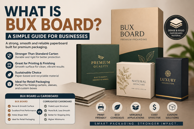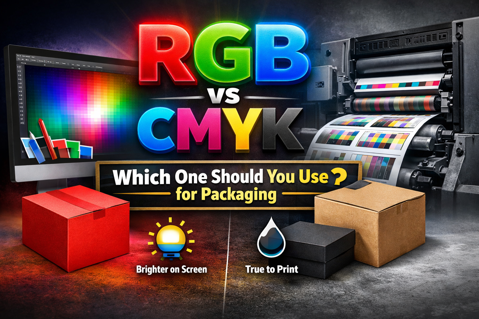
If your design is going on a printed box, use CMYK. Screens and printing presses don’t work the same way. A monitor creates color with light, which is why RGB often looks brighter than it really is. Once that same file is printed on cardboard or kraft, the tone can shift slightly. Setting things up in CMYK from the start usually keeps the final result closer to what you expected.
RGB vs CMYK: Which One Should You Use for Packaging?
Color problems in packaging rarely look dramatic. They look subtle. And that’s exactly why they hurt brands.
You approve a design on your screen. The blue feels bold. The red looks energetic. Everything seems perfect. Then the printed boxes arrive, and something feels slightly off. Not wrong enough to reject. But not sharp enough to impress.
That gap between screen and print usually comes down to one decision: RGB or CMYK.
Why This Decision Affects Your Brand More Than You Think
Packaging is physical. It lives under retail lights, in shipping cartons, in customers’ hands. When color shifts even slightly, customers notice it, even if they cannot explain why.
Inconsistent color can:
- Reduce shelf impact
- Make your brand look less premium
- Cause marketing photos to mismatch packaging
- Lead to reprints and extra production cost
For businesses investing in custom packaging, color accuracy is not a design detail. It is part of brand credibility.
Choosing the wrong color mode can quietly increase your production costs.
Why RGB and CMYK Aren’t the Same Thing
At a basic level, the difference is technical. But its impact is practical.
RGB stands for Red, Green and Blue. It is a light-based color system. Screens create color by emitting light.
CMYK stands for Cyan, Magenta, Yellow, Black. It is an ink-based system. Printing presses apply ink onto material surfaces that reflect light.
That one difference changes how color appears.
RGB produces brighter, more vibrant tones because screens glow.
CMYK produces realistic, print-accurate tones because ink absorbs into material.
Your monitor creates color.
Your packaging reflects it.
That is why RGB artwork often looks more intense on screen than it does in print.
What Actually Happens When RGB Files Go to Print
When RGB artwork is sent to a printing press, it must be converted into CMYK. That conversion compresses the color range.
In real production, this can result in:
- Blues shifting toward navy or purple
- Bright greens appearing muted
- Reds printing slightly darker
- Gradients losing smooth transitions
- Black tones lacking depth
The effect becomes more noticeable depending on material.
On coated cardboard stock, color reproduction is sharper.
On uncoated kraft board, ink absorbs more deeply, softening vibrancy.
On rigid boxes, the dense surface can produce richer tones.
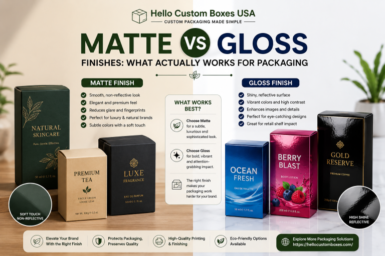
Finishing choices also influence results:
- Gloss lamination enhances contrast
- Matte lamination softens brightness
- Soft-touch coatings subtly mute saturation
Color does not exist in isolation. It interacts with board type, coating, and print method.
Offset printing especially requires accurate CMYK preparation. Digital printing offers some flexibility but still depends on proper color setup.
Common Packaging Artwork Mistakes Brands Make
The most frequent issue we see is late conversion.
Designers build the entire layout in RGB because it looks better on screen. Then, just before production, they convert the file to CMYK. By that stage, the software adjusts the colors automatically, and subtle shifts occur without careful review.
Other mistakes include:
- Ignoring embedded color profiles
- Not checking how brand colors translate on kraft stock
- Overlooking bleed and margin alignment
- Assuming screen previews match printed output
Designing directly in CMYK from the start avoids most of these problems.
Material Matters: How Board Type Changes Color Appearance
Even with CMYK set up properly, the material still influences the outcome.
Coated cardboard is fairly predictable. The smoother surface keeps edges clean and helps colors stay sharp. It’s a reliable choice when vibrancy is important.
Kraft doesn’t behave the same way. It absorbs more ink, and its natural color shifts the final look slightly. Tones can come out softer than expected.
Rigid boxes feel different again. Their dense structure holds ink well, which can create deeper, more saturated results.
If your brand relies on color precision, the substrate matters just as much as the file settings.
So, Which Color Mode Should You Use for Packaging?
The answer is simple.
Always use CMYK for print-ready packaging files.
If your brand depends on a very specific shade, especially in your logo, Pantone can make sense. It gives you tighter control over how that color prints from one run to the next.
For most standard box production, though, CMYK is what the press is built to use. It’s the working format behind regular packaging jobs.
Starting your design in CMYK instead of converting it later usually avoids the small color shifts that happen during last-minute changes. It simply keeps the printed result closer to what you originally approved.
If you want to double-check your setup, you can download our print-ready artwork guidelines to avoid unnecessary delays.
Quick FAQ
Why does my packaging look darker than my screen?
Screens emit light. Printed materials reflect light. Reflection reduces brightness naturally, which makes printed colors appear slightly darker.
Can RGB ever be used in packaging design?
RGB is useful for digital mockups, social media visuals, and online previews. It should not be used for final print files.
Is converting from RGB to CMYK enough?
Technically yes, but color shifts can occur. Designing directly in CMYK provides more predictable results.
What is CMYK printing exactly?
CMYK is the ink-based color system used in commercial printing. It works by layering cyan, magenta, yellow, and black inks to create the final printed color. If you want a clearer breakdown of the process, we’ve explained howCMYK printing works in a separate guide.
Do coatings change how color looks?
Yes. Gloss enhances contrast, while matte and soft-touch finishes slightly reduce vibrancy.
At Hello Custom Boxes, every artwork file goes through a prepress review before production begins. If a file arrives in RGB, we identify it early and guide clients through proper CMYK setup. We also assess how the chosen board type, whether cardboard, kraft, or rigid, will influence final color appearance.
It’s easier to fix a file before anything goes to print. Once boxes are produced, changes become expensive and time-consuming.
Most people don’t notice color settings until something looks slightly off. Maybe the blue feels heavier. Maybe the red doesn’t pop the way it did on screen. Nothing dramatic — just not quite the same.
Working in CMYK from the start won’t solve everything, but it does cut down on those small surprises. The final print usually ends up much closer to what you signed off on, and that means fewer issues after production.