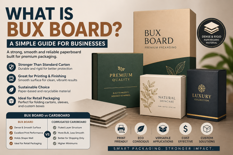
What Is Bux Board? A Simple Guide for Businesses
TL;DR — Quick Answer Bux Board is a dense paperboard material used in packaging when you need more strength than standard folding…
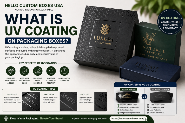
The Packaging Printing Guide by Hello Custom Boxes USA is a practical resource for brands looking to understand printing methods, color systems, artwork setup, and finishing options for custom boxes. It covers offset and digital printing, RGB vs CMYK, Pantone matching, dielines, bleed setup, and coatings to help businesses make informed production decisions and achieve consistent, professional packaging results.
TL;DR — Quick Answer Bux Board is a dense paperboard material used in packaging when you need more strength than standard folding…
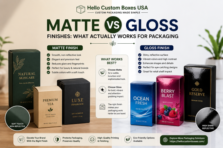
TL;DR — Quick Answer • Matte and gloss mainly change how packaging looks, feels, and wears over time • Matte gives a…
You only notice it when something feels off You open a shipment and the boxes look fine at first. Colors are sharp,…
You notice it before you touch the box A customer picks up your product. Same shelf, same price range, similar design. But…
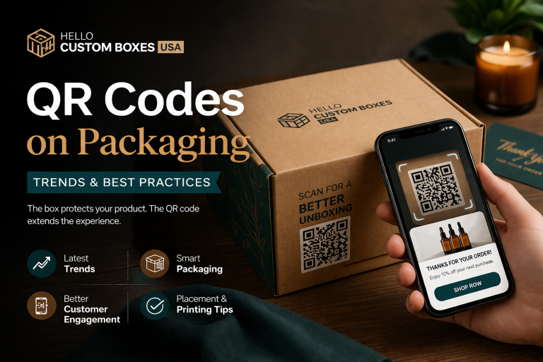
You ship an order. The box arrives intact, print looks sharp, branding is clean. But after that moment, the interaction ends. No…
A client once approved a box that looked clean on screen. The logo was there, centered, sharp. But when the physical packaging…
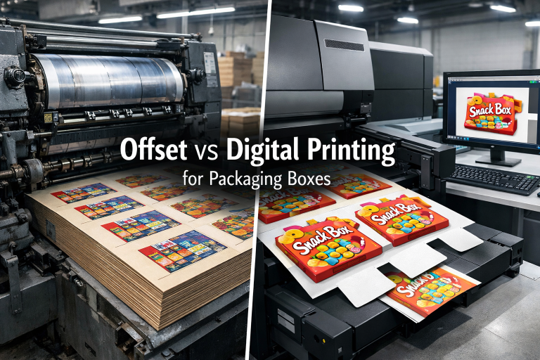
When it comes to printing packaging boxes, most projects end up choosing between offset and digital. Both methods work. The real difference…
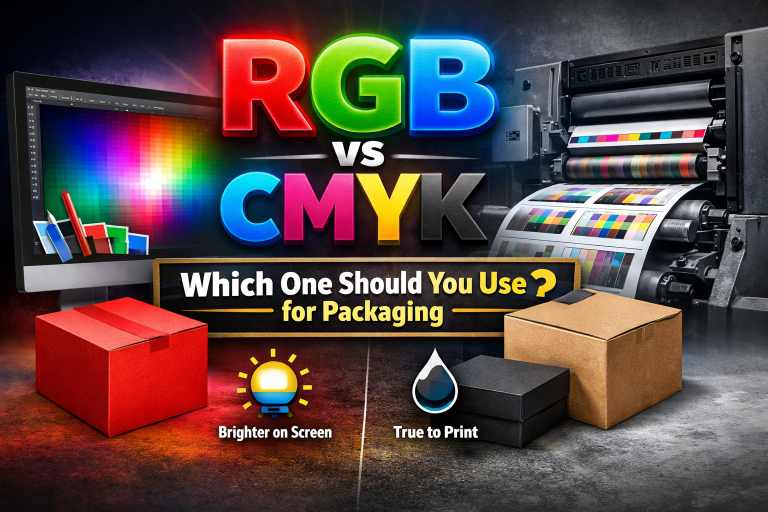
If your design is going on a printed box, use CMYK. Screens and printing presses don’t work the same way. A monitor…
A screen shows color with light. Printing puts ink onto paper or cardboard, so the result changes with the material, ink coverage, and finish. You’ll notice this even more on brown kraft board. The surface color shows through some inks and can make them look darker or less bright. If a brand color is important, ask how it will be matched before the full order goes to print.
No. Plenty of businesses start with a logo, some text, and a rough idea of what they want on the box. If you already have finished artwork, send the original file rather than a screenshot pulled from your website. That gives the prepress team more to work with and usually saves time when the design is being checked.
Because a small image file can lose quality when it’s enlarged.nnVector artwork can be resized without the edges turning blurry or jagged. This matters when the same logo has to appear on a small carton today and a much larger shipping box later.nnIf you only have a PNG or JPG, ask whether it’s good enough before rebuilding the whole design.
It’s common, but not the only option. CMYK builds colors by combining four inks. It works well for photographs, illustrations, and designs with several colors. Spot colors may be a better choice when a particular brand shade needs tighter control. The printing method, order quantity, material, and artwork all play a part in that decision.
Sometimes. It depends on the font, print method, board surface, and how small the text actually is. Thin lettering that looks sharp on a laptop can fill in or become difficult to read once printed. I’d pay particular attention to ingredient lists, instructions, contact details, and other copy customers genuinely need to read.
For new artwork, I would. Check the spelling, dimensions, logo position, barcodes, phone numbers, and anything else that would be expensive to discover after production. Don’t assume someone else has already checked every word. A proof won’t always show exactly how ink will behave on the final material, but it can catch a lot of avoidable mistakes.
Because the ink is being printed over a brown surface rather than a white one. Some colors become darker or lose contrast. White ink can sometimes be printed underneath parts of the artwork, depending on the printing process and the result you want. If you like the natural kraft look, it often makes more sense to design around the material instead of trying to make it behave like white paperboard.
There isn’t one method I’d choose for every order. A short run with changing artwork has different needs from a large repeat order using a simple design. Box material, print coverage, quantity, budget, and the level of detail in the artwork all matter. Start with the job you need the packaging to do. The printing method can be chosen from there.