TL;DR – What Is CMYK Printing?
CMYK printing is how color is handled once designs move from screen to paper. It works with ink, not light, which is why printed colors behave differently than digital ones. Most print issues come from ignoring this difference. When files are prepared with CMYK in mind and matched to the right material, printing becomes far more predictable.
Most people notice CMYK printing only after something goes wrong. A box arrives. The colors feel dull. The blue is off. The black looks flat. On screen, everything looked fine.
That gap between screen and print is where CMYK comes in.
Anyone dealing with printed packaging or labels learns pretty quickly that knowing how CMYK works avoids delays, reprints, and unnecessary cost.
What CMYK Printing Really Is
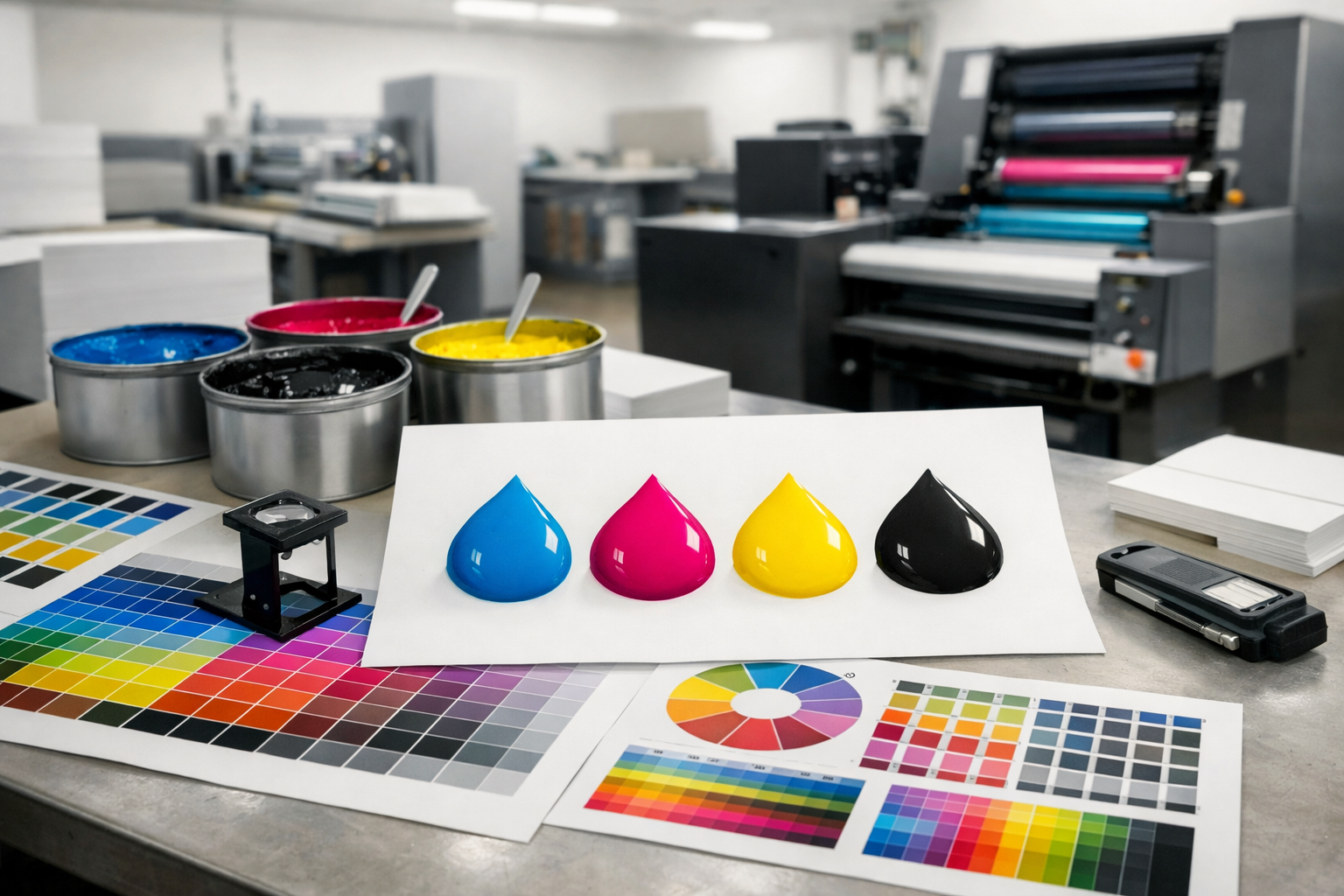
CMYK printing is simply the color system used for ink on paper and cardboard. Instead of light, it relies on ink coverage.
The letters stand for cyan, magenta, yellow, and black. Every printed color you see is created by layering these inks in different amounts. There is no glow. No backlight. Just ink absorbing and reflecting light.
That is why CMYK is for print, and why screen colors do not behave the same way once they are printed.
Why Printing Uses CMYK Instead of Screen Colors
Screens create color by emitting light. Printing does the opposite. Ink blocks light.
This difference matters more than most beginners expect. A color that looks vibrant on a monitor can soften once ink hits cardboard. Some bright digital colors cannot be reproduced at all in print.
This is not a printer issue. It is how the CMYK color model works.
That’s usually when CMYK stops being a headache.
Understanding CMYK Colors Without Overthinking It
When people talk about CMYK colors, they are usually talking about ink percentages, not what the color “looks like” on screen.
For example:
- Reds rely heavily on magenta and yellow
- Greens come from cyan and yellow
- Neutral tones depend on careful black balance
Small changes in ink values can change how a color feels once printed, especially on packaging materials like kraft or recycled board.
That is why color control matters so much in packaging projects.
What Is CMYK Color in Practical Terms
CMYK is the color format printing machines are set up to work with.
Files created this way usually print as expected, while RGB files often need conversion later, which is where results can start to shift.
Starting in CMYK reduces those surprises.
CMYK Printing and Packaging Materials
CMYK ink never reacts the same way across materials. Cardboard, kraft, coated paper, and uncoated board each take in color a little differently.
That is why a CMYK file can look:
- Sharper on white coated stock
- Softer on kraft
- Slightly darker on thicker board
This is normal, and experienced packaging teams account for it before production. At Hello Custom Boxes, print files are reviewed with the material in mind, not just the color values on screen.
CMYK Ink and Printing Equipment
Every CMYK printer works with physical ink or toner. Even advanced presses rely on the same four-color foundation.
Print quality depends on more than the file:
- Ink density
- Press calibration
- Board texture
- Print method
That is why two printers can produce slightly different results from the same CMYK file.
Consistency comes from process, not just design.
Using CMYK Color Charts and Swatches
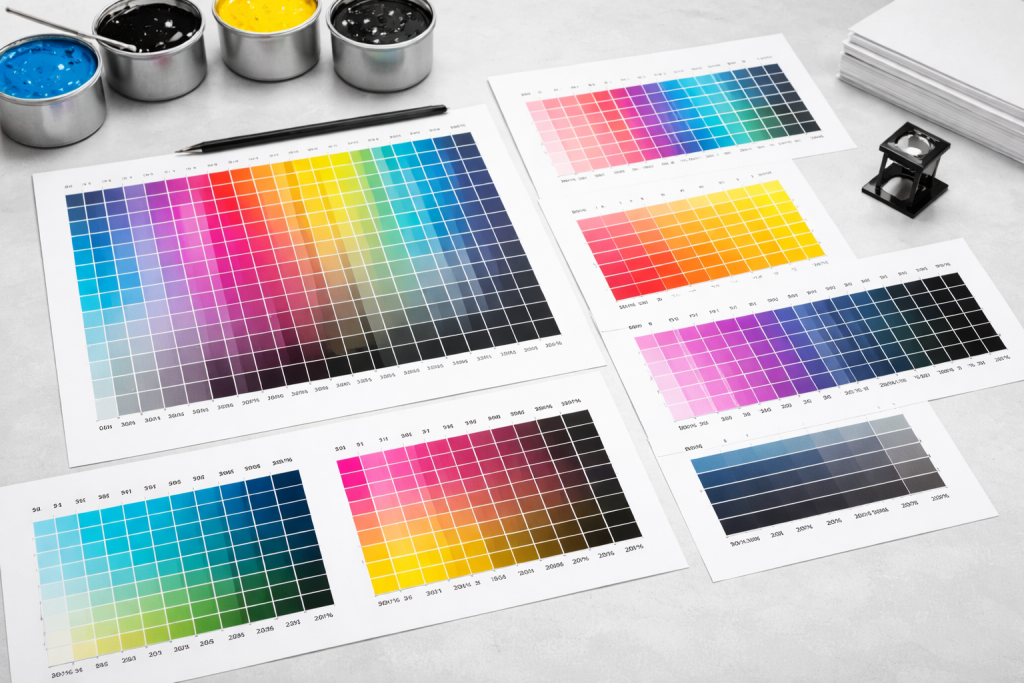
Screens are helpful, but they are not final proof. That is where CMYK colour charts and color swatches CMYK come in.
Swatches show how specific ink combinations actually print. They help when:
- Matching brand colors
- Printing large quantities
- Working with non-white materials
Experienced designers rely on printed samples more than screen previews when accuracy matters.
Creating CMYK Colors the Smart Way
If you want to create CMYK color without headaches, the key is timing.
Set the file to CMYK early. Do not design in RGB and convert at the last minute. Late conversions often flatten colors and shift tones.
Good CMYK files are built with print in mind from the start.
CMYK Printing in Real Packaging Projects
In packaging, color mistakes stand out fast. Customers notice when boxes look inconsistent or off-brand.
That is why CMYK printing is treated seriously in custom packaging. It is not just about color. It affects how premium, reliable, or professional a brand feels.
When custom packaging is involved, many brands bring in experienced teams such as Hello Custom Boxes early, simply to avoid mismatches between files, materials, and final color.
Common Beginner Mistakes With CMYK Printing
Most CMYK issues come from a few simple missteps:
- Designing only for screen
- Ignoring material behavior
- Expecting exact screen-to-print matches
Giving CMYK some attentions early on cuts down these problems and keeps the printing process from getting unnecessarily messy later.
Final Thoughts
CMYK printing is not complicated once you stop thinking of it like digital color. It follows different rules because it solves a different problem.
Print is physical. Ink behaves differently than light. Once that clicks, CMYK becomes a tool instead of an obstacle.
CMYK is still what printing runs on when it comes to packaging, labels, and branding. When color really matters, experience is usually what keeps those colors from drifting once they hit paper.